Comments on @hansey ‘s site:
Category: Assignment 1 – Midterm Review – Module 1&2 Blog Posts and Comments
In this module I was tasked with thinking about the effectiveness and accessibility of my teaching materials, and how the design of these materials can hinder or assist learners during their learning journey. We went over quite a few topics, so let’s dive in!
Accessibility
I had never used text to speech tools before, and I wasn’t aware of them being widely available online. I also never knew the difference between open and closed captioning, or why people without hearing impairments might use them. Now I understand that accessibility tools work to better the world for everyone, like through ramps on sidewalks or banisters on stairs. I like that we discussed solving for one and extending to many in this sense, as more than just disabled people utilize accessibility measures.
Accessibility goes past the physical realm and into online design as well. We discussed the best design choices for sites to be the most accessibility friendly for text to speech readers and those with visual disabilities, like always including text descriptions for images and giving control back to the learner regarding video playback. As someone who has a mind that tends to wander, being able to go back in videos definitely struck a chord with me, I didn’t even know that was an accessibility feature!
Design Principles and Presentations
This module introduced me to the nature of the human brain when it encounters certain design elements. In presentations and in infographics we were told to focus on our alignment, reduce contrast (or use it to our advantage), utilize repetition, always consider proximity and leave lots of negative space. I realized that in my first module screencast I had broken more than a few of the design principles, as well as the presentation specific principles like keeping one idea per slide, having no more than one idea on each slide, and having a larger title than the written content on my screen. For the final project I will definitely be focusing on these areas more. I tried to utilize the design principles while I was creating my infographic for this module, I focused particularly on my use of negative space, contract and repetition, hopefully I was successful in creating something that is easy to read and remember.
I have attached my infographic about Antioxidant rich foods below.
Alt-text Infographic about Antioxidants: This infographic talks about what antioxidants are and what foods are antioxidant rich as well as their the specific antioxidant names found in each food.
A transcript of the infographic is as follows:
The first box “what are antioxidants” says “Antioxidants are naturally occurring chemicals that protect human cells from free radicals caused by pollution. By protecting cells from harm, antioxidants help to reduce the risk of chronic diseases! Many foods provide antioxidants. The best sources based on their antioxidant ratio’s have been listed below.” with an image of a woman beside it. An image of a coffee is below the box of described text. The image of the coffee has another box beside it with a title “Coffee” and text that reads “Coffee is high in an antioxidant called cholorogenic acid. This powerful antioxidant is known for it’s weight loss and blood pressure regulating properties.” below this textbox is an image of a chocolate bar. Next to the chocolate bar image is a box with the title “Dark Chocolate” and the text “Dark chocolate contains several antioxidants such as catechin, anthocyanin and proanthocyanidin. These compounds have been associated with cardiovascular health and blood pressure regulation” Below this text is an image of blueberries. Next to the blueberries is a box with the title “Blueberries” and the text “Blueberries are high in anthocyanins, an antioxidant that has been associated with lowering blood pressure, good cardiovascular health and healthy urinary tracts.” below this textbox is an image of cinnamon. Next to the image of cinnamon is a textbox with the title “Cinnamon” and the text “Cinnamon is high is a compound called cinnamaldehyde, which has been praised for it’s anti-inflammatory properties”
WAVE accessibility checker
When I checked my last blog post against the WAVE accessibility checker I was surprised by their results. There were contrast errors I wasn’t aware of because I myself had missed the text while reading! The WAVE site also highlighted my video as an error as it’s a “video/audio” component. After going through this module I now realize why it highlighted this as a problem, my video does not include closed or open captioning, making it a poorly accessible resource. Furthermore, the embedded video does not have embedded information in the case of it being unavailable for any reason, meaning that if a person with a screen reader attempted to read through the page they may not even know that a video was embedded.
I’ve attached the WAVE results for my last post below:
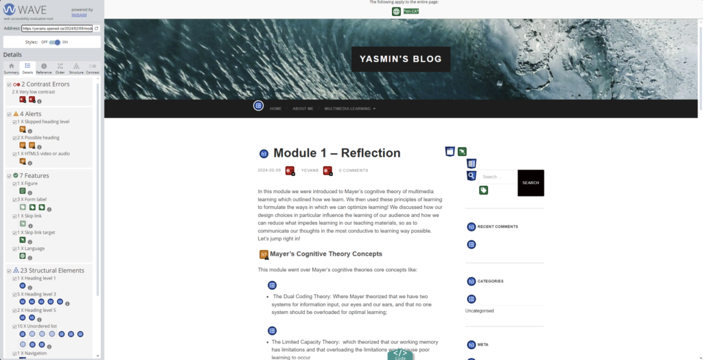
Alt-text Image of the WAVE (Web accessibility evaluation tool), image shows the WAVE accessibility tools scoring on the left and on the right is Yasmin’s module 1 blog post.
Text to speech screen readers
When I tried the natural reader site I was surprised at how human the text to speech sounded. I will definitely be making use of this tool in the future as I do have a habit of allowing my mind to wander while I read, and getting stuck in a loop of reading the same sentences over and over again. I also tend to read quite quickly, so I think this tool helped to slow me down a little and hopefully absorb more of the information.
Knowing what I know now I’ll be on the lookout for more accessibility features and how I might utilize them on a day to day basis, as well as how I might incorporate them into my work so my designs and thoughts can be conveyed to everyone!
In this module we were introduced to Mayer’s cognitive theory of multimedia learning which outlined how we learn. We then used these principles of learning to formulate the ways in which we can optimize learning! We discussed how our design choices in particular influence the learning of our audience and how we can reduce what impedes learning in our teaching materials, so as to communicate our thoughts in the most conductive to learning way possible. Let’s jump right in!
Mayer’s Cognitive Theory Concepts
This module went over Mayer’s cognitive theories core concepts like:
- The Dual Coding Theory: Where Mayer theorized that we have two systems for information input, our eyes and our ears, and that no one system should be overloaded for optimal learning
- The Limited Capacity Theory: which theorized that our working memory has limitations and that overloading the limitations would cause poor learning to occur
- Active processing: the theory that active participation from students allows for information to become better absorbed by students.
Within these three core concepts of Mayer’s theories lie many more concepts that fall into three sub categories each. Each sub category is related to the type of workload the learner and their brain must overcome in order to learn under the core principles.
The first workload we explored was the extraneous cognitive load. This type of load would cause learners to work harder to understand the information the teacher was presenting them due to the work included in deciphering the content, this type of load is amplified when too many listening and visual components are used, the presenter goes off topic and when images and words are too far from their context in a presentation.
The second workload was the intrinsic load, which focussed on the concepts to be learnt by the learner, and how we can make it easier for them to learn through segmenting the information, building on information throughout the learning process and our narration.
Finally there was the Germane load, which is the load which describes the perfect level at which a learner will both understand new things and retain information. Germaine and intrinsic loads should be built upon using Mayers principles, while extraneous loads should be minimized.
Of all of the principles of Cognitive Theory and Multimedia Learning in this module the one I found most intuitive was the redundancy principle. The redundancy principle made the most sense to me because I have had first hand experiences in being overwhelmed by text, pictures and narration during presentations. To add to that, I was very interested in the dual coding theory by Allan Paivio, whereby he suggested that the brain had two systems for information input, visual and verbal. Allans theory resonated with me as I recall times when presentations I’ve seen showed pictures or limited text with narration and I was able to recall information about them later far easier then if they had both text and narration. I guess less really is more! Conversely, out of all of the principles I was definitely most surprised by the pretraining principle, I had never thought to build up the information in my presentations rather then show all of the information at once, I can see how that would allow learners to more easily connect concepts now that I have attempted to utilize it myself in my screencast.
Screencasting
Below I have attached my screencast about professional netiquette for this module, I hope you enjoy!
While creating my screencast I imagined that my audience was a group of young professionals looking to learn how to professionally and politely interact with one another online! I choose to keep my design simple and to the point as this presentation is for a professional audience, I also decided to explore professional modes of online interaction so it further connects with my desired audience.
During the creation of my screencast I found that it was hard to balance Mayers principles and the content I wanted to show. I had a lot to say about this subject but I didn’t want to overwhelm the viewer with my narration, on screen text or visuals all at once. I hope that by utilizing the pretraining principle, reducing redundancy and segmenting my information into bullet lists I was able to build the information up for my viewer coherently. An unexpected hiccup for me during the creation of this screencast was my timing for narration, in the past when I have had text on the screen to read directly off of I haven’t had to think about when I might want to say something between bullet points or on screen visuals, this was definitely a hurdle for me, but I hope to get better at it before the final presentations are due!
Recent Comments