In this module I was tasked with thinking about the effectiveness and accessibility of my teaching materials, and how the design of these materials can hinder or assist learners during their learning journey. We went over quite a few topics, so let’s dive in!
Accessibility
I had never used text to speech tools before, and I wasn’t aware of them being widely available online. I also never knew the difference between open and closed captioning, or why people without hearing impairments might use them. Now I understand that accessibility tools work to better the world for everyone, like through ramps on sidewalks or banisters on stairs. I like that we discussed solving for one and extending to many in this sense, as more than just disabled people utilize accessibility measures.
Accessibility goes past the physical realm and into online design as well. We discussed the best design choices for sites to be the most accessibility friendly for text to speech readers and those with visual disabilities, like always including text descriptions for images and giving control back to the learner regarding video playback. As someone who has a mind that tends to wander, being able to go back in videos definitely struck a chord with me, I didn’t even know that was an accessibility feature!
Design Principles and Presentations
This module introduced me to the nature of the human brain when it encounters certain design elements. In presentations and in infographics we were told to focus on our alignment, reduce contrast (or use it to our advantage), utilize repetition, always consider proximity and leave lots of negative space. I realized that in my first module screencast I had broken more than a few of the design principles, as well as the presentation specific principles like keeping one idea per slide, having no more than one idea on each slide, and having a larger title than the written content on my screen. For the final project I will definitely be focusing on these areas more. I tried to utilize the design principles while I was creating my infographic for this module, I focused particularly on my use of negative space, contract and repetition, hopefully I was successful in creating something that is easy to read and remember.
I have attached my infographic about Antioxidant rich foods below.
Alt-text Infographic about Antioxidants: This infographic talks about what antioxidants are and what foods are antioxidant rich as well as their the specific antioxidant names found in each food.
A transcript of the infographic is as follows:
The first box “what are antioxidants” says “Antioxidants are naturally occurring chemicals that protect human cells from free radicals caused by pollution. By protecting cells from harm, antioxidants help to reduce the risk of chronic diseases! Many foods provide antioxidants. The best sources based on their antioxidant ratio’s have been listed below.” with an image of a woman beside it. An image of a coffee is below the box of described text. The image of the coffee has another box beside it with a title “Coffee” and text that reads “Coffee is high in an antioxidant called cholorogenic acid. This powerful antioxidant is known for it’s weight loss and blood pressure regulating properties.” below this textbox is an image of a chocolate bar. Next to the chocolate bar image is a box with the title “Dark Chocolate” and the text “Dark chocolate contains several antioxidants such as catechin, anthocyanin and proanthocyanidin. These compounds have been associated with cardiovascular health and blood pressure regulation” Below this text is an image of blueberries. Next to the blueberries is a box with the title “Blueberries” and the text “Blueberries are high in anthocyanins, an antioxidant that has been associated with lowering blood pressure, good cardiovascular health and healthy urinary tracts.” below this textbox is an image of cinnamon. Next to the image of cinnamon is a textbox with the title “Cinnamon” and the text “Cinnamon is high is a compound called cinnamaldehyde, which has been praised for it’s anti-inflammatory properties”
WAVE accessibility checker
When I checked my last blog post against the WAVE accessibility checker I was surprised by their results. There were contrast errors I wasn’t aware of because I myself had missed the text while reading! The WAVE site also highlighted my video as an error as it’s a “video/audio” component. After going through this module I now realize why it highlighted this as a problem, my video does not include closed or open captioning, making it a poorly accessible resource. Furthermore, the embedded video does not have embedded information in the case of it being unavailable for any reason, meaning that if a person with a screen reader attempted to read through the page they may not even know that a video was embedded.
I’ve attached the WAVE results for my last post below:
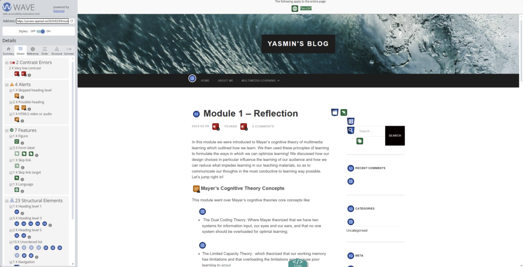
Alt-text Image of the WAVE (Web accessibility evaluation tool), image shows the WAVE accessibility tools scoring on the left and on the right is Yasmin’s module 1 blog post.
Text to speech screen readers
When I tried the natural reader site I was surprised at how human the text to speech sounded. I will definitely be making use of this tool in the future as I do have a habit of allowing my mind to wander while I read, and getting stuck in a loop of reading the same sentences over and over again. I also tend to read quite quickly, so I think this tool helped to slow me down a little and hopefully absorb more of the information.
Knowing what I know now I’ll be on the lookout for more accessibility features and how I might utilize them on a day to day basis, as well as how I might incorporate them into my work so my designs and thoughts can be conveyed to everyone!
Hi Yasmin , I paid attention to your infographic first, which gives me a very fresh feeling. The color of blue Antioxidants is a good fit for your theme of Antioxidants, or health, because the following antioxidants rich foods will benefit us, so a touch of blue suits the reader’s mood. Secondly, the painting style of your picture is unified cartoon style, which is in line with the knowledge we have learned in Module 2, which I think is relatively troublesome, because I did not work well in my work in this part, haha. Also, your typography looks comfortable because it is arranged neatly. All in all it’s a very nice infographic. I like it.